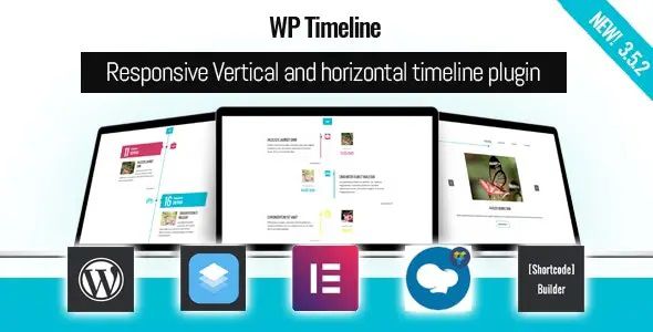
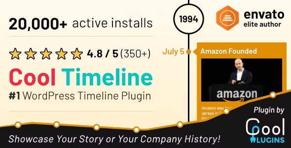
 WordPress Theme
 WordPress Plugin
 Pages Builder
 Elementor
 WooCommerce
 ChangeLog
Essential Grid – Responsive WordPress Gallery Plugin

$3.90

Original Product
Lifetime Updates
Unlimited Website Usage
Safe & legal under GPL
 By
ByEssential Grid is one of the most flexible gallery plugins for WordPress. The plugin lets you build beautiful, fully responsive grids for your posts, images, videos, WooCommerce products, or custom content – all with an intuitive visual builder.
Key features of Essential Grid:
-
Supports Multiple Content Types
Create grids using WordPress posts, pages, custom post types, WooCommerce products, YouTube/Vimeo videos, or self-hosted media. -
Visual Skin Editor
Drag and drop to design grid layouts—customize fonts, colors, spacing, overlays, hover effects, and more without code. -
Filterable & Sortable Grids
Add category-based filters and custom sort orders for an interactive and user-friendly experience. -
Fully Responsive & Retina-Ready
Grids adapt beautifully to any screen size or device, delivering high-quality visuals across desktops, tablets, and smartphones. -
Pre-Made Skins & Layout Templates
Choose from dozens of professionally designed skins to speed up your grid creation process. -
Custom Grid Animation & Effects
Bring your content to life with entry animations, hover effects, lightbox integration, and parallax scroll. -
Optimized Performance
Built with performance in mind—lazy loading, efficient queries, and caching ensure fast load times.
Related products